
Aligning the Digital & Physical Experiences
OVERVIEW
The Exploratorium is a museum in San Francisco that allows visitors to explore a wide variety of topics from science to art through hands-on learning. My team and I had an amazing opportunity to serve as design consultants for the Exploratorium. We were asked to assist the Design, Brand and Web Development teams to improve their visitor experience, as they were having trouble matching the real-life experience with the online experience and were open to some inspiration for their upcoming re-design.
Team Members : 3
My Role : UX Designer & Strategist
Duration : 2 weeks
Tools & Methods :
Website Review
Review of 3rd Party Research Analysis
Business Analysis & Strategy
Usability Testing
Paper Prototype
Site Visit (Interviews with Staff and Visitors)
Social Media Listening
Affinity Mapping
Story Boarding
Wireframe Creation
one website, two audiences
The website has a dual purpose:
For visitors to gather the necessary information they need for their visit to the physical space.
Serves as a large resource center of information for educators to utilize when teaching their students.
the SOLUTION
We redesigned the visit section of the Exploratorium website to not only better reflect the look and feel of the museum itself, but to improve the usability of the site based on insights from research we'd gathered from staff, social media listening and visitors.
4 new features A SIMPLE navigation A Video Storyline
Concept
our Methods & process
In Two Weeks…

A timeline depicting how we spent our time during the two weeks and what we accomplished a long the way.
research

Homepage
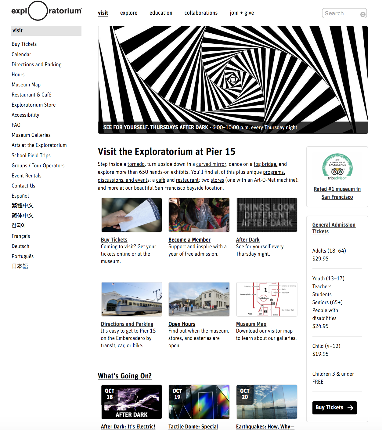
Current Visit Page
understanding our client’s NEEDS
In order to get a better understanding of how the Exploratorium website is used by visitors, what the Exploratorium goals are through the website de-design, and where we saw opportunities for growth, we held a meeting with the Head of Web Development and the Senior UX Designer who were able to provide us with a starting point.
A look into previous research
At our initial meeting, we were handed a research report which consisted of findings that were previously uncovered by a third party design agency. Our client had mentioned that because they have been working on the website for a long time, they would love for us to get creative and bring in a fresh perspective. After reading and discussing the report with one another, my team and I were able to get. a clearer idea of who the website audience was and how we could dig deeper to find the right opportunities for improvement which also aligned with their request for something new.
THEIR METHOD : surveys, user interviews
WHAT THEY FOUND OUT : Teachers, students, and individuals who are looking for information on specific topics make the biggest percentage of website visitors.
we have our starting point
The biggest find that was the key driving force to our process was that the research report made it clear that the majority of people who were visiting the website weren’t looking to find their way to the physical space of the Exploratorium. They were solely looking for content to read and to use for educational purposes, and this confirmed that the visit page would be catered to a separate audience.

THINKING ABOUT the “CYCLE” that the visitor goes through
Our “visit page” would support those who want more information on the physical space and would like to plan a trip to the Exploratorium.
exploring the current “visit page”with FUTURE visitors
My team and I conducted a heuristic evaluation of the website and it didn’t take us very long to come across some problem areas. We felt it was important to see how our future visitors and users feel about the current site, as these are the people who we are designing for, so we decided to work with them!
USABILITY TESTING WITH 8 PARTICIPANTS CARD SORTING ACTIVITY WITH 6 PARTICIPANTS PUT IT TOGETHER AND WHAT HAVE WE GOT?
We gave our users tasks to complete on the current website page to understand the flow of the website, where they were running into trouble, and how they felt overall with the look and feel of the website.
The Tasks :
Walk me through how you would use the website in order to plan a trip.
Show me how you would buy 1 admission ticket, then show me how you would add another one to your cart.
You are a teacher planning on bringing your students for a Field Trip, where would you go to get more information on visiting with large groups such as yours?
Overall, how do you feel about the look and usability of the website? What about the website makes you want to visit the Exploratorium, and what doesn’t?

We were able to get a peek inside the minds’ of our participants by observing them group words together and see how they envision the navigation bar to be. We wanted to clarify and see if our previous heuristic evaluation was sending us in the right direction.
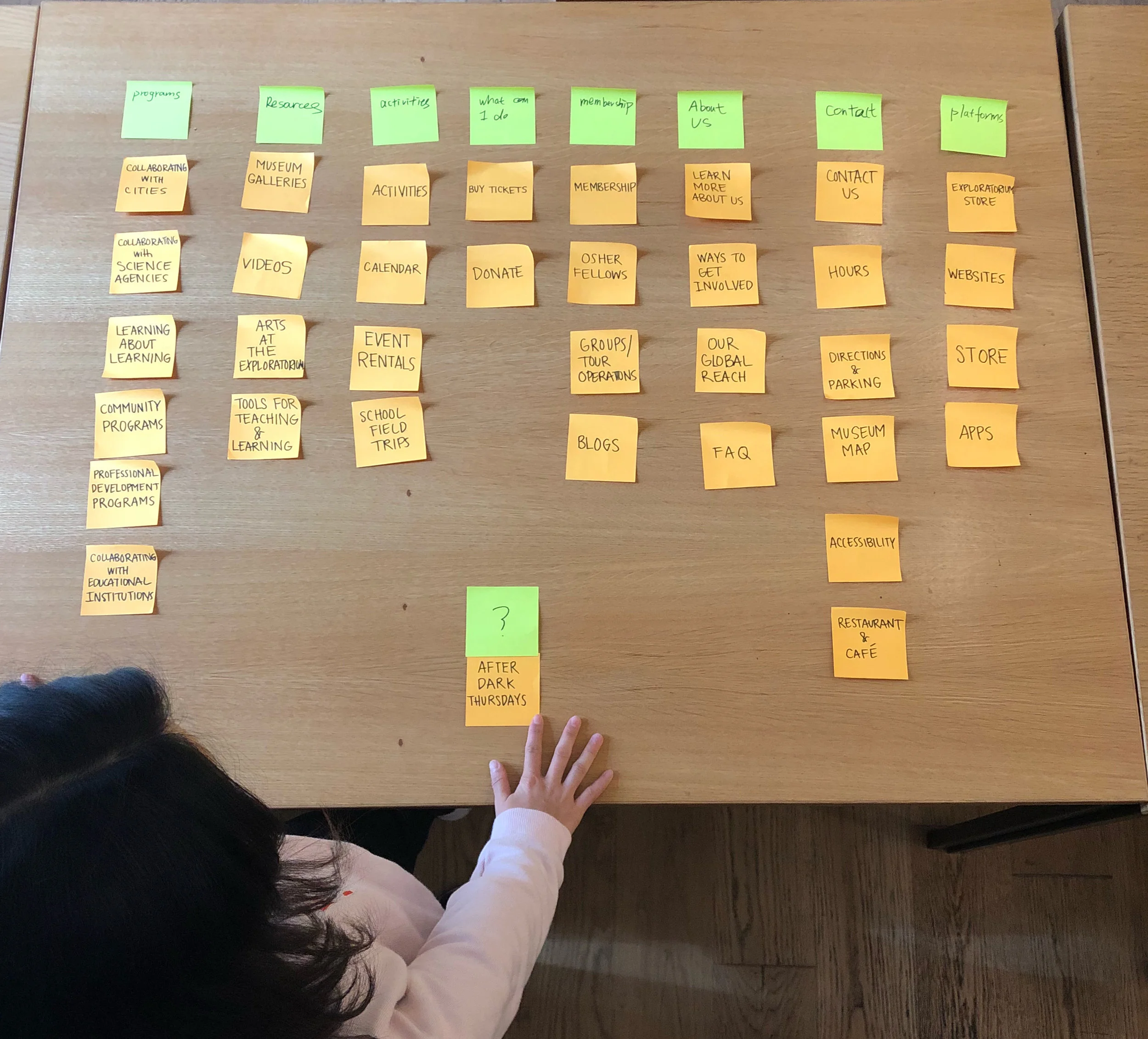
Key Insights
Users had to click through many pages when purchasing a ticket.
There was confusion between some of the terms listed in the navigation
(ex. Visit vs. Explore)
There were design principles not being followed on the website.
(ex. Lack of consistency, no proper hierarchy, no color to indicate way finding)
Users were not able to get a proper picture of what they should expect at the Exploratorium as the website lacked proper visual communication (Imagery, videos, the captivating feel)
one website, two problems
After realizing that now we had 2 problems to tackle and not just one, we took a step back and decided that we would support our users by
A organized and seamless navigation that keeps all the information still in tact, but eases the search experience for our visitors
A visitors page that not only focuses on a new look and feel, but also is able to reduce the amount of clicks it takes for the user to get to their destination
what happens at the exploratorium…stays at the exPloratorium
To get a better understanding of what the Exploratorium experience at the physical space is like, we decided to make multiple visits and see for our selves! This also gave us an excellent opportunity to take our clients along in the journey with us through follow-up meetings and work with them more closely.
NOW WE’RE ON TO SOMETHING

Interviewing an “Explainer” to see what his day to day is like, what common questions he’s being asked, and if visitors refer to the website when interacting with the exhibits.
THE TAKEAWAY: Many teachers make their own worksheets for their students by using the information on the website.

Red signs were used throughout the space as a way finding tool for visitors.
THE TAKEAWAY: Since red is the way finding color at the physical space, we can align the website by using the same color to signify all clickable buttons and links.
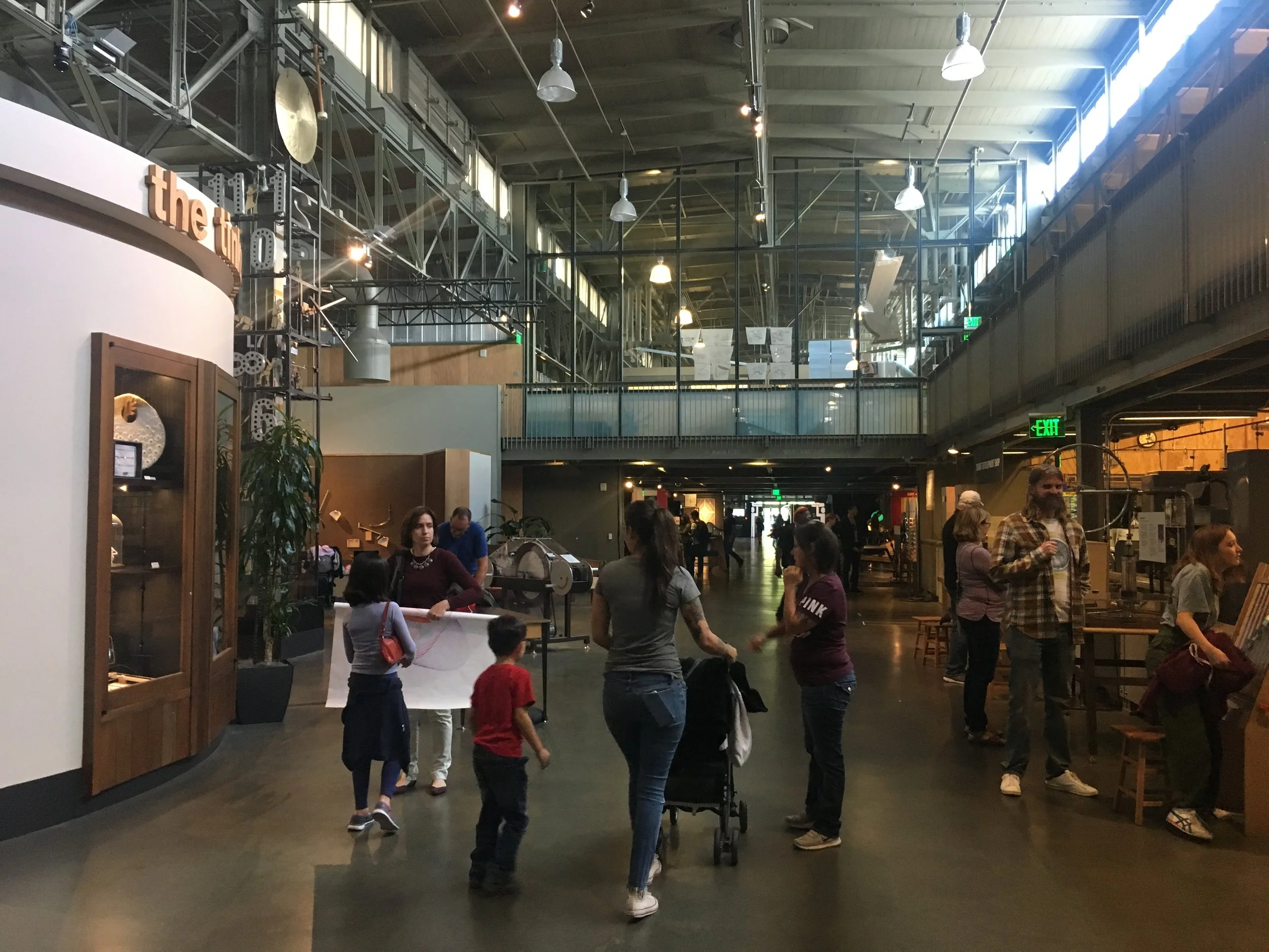
Parents and children were roaming around and interacting with the exhibits. We were able to speak with a few and see how their visit has been from the good to the bad.
THE TAKEAWAY : Parents were curious to know what exhibits were age appropriate for their child.

We kept our client in the loop with our findings and ideas along the way. It was important for us to have them involved in the process and stay on the same page as us and vice versa.
THE TAKEAWAY : Teamwork makes the dream work!
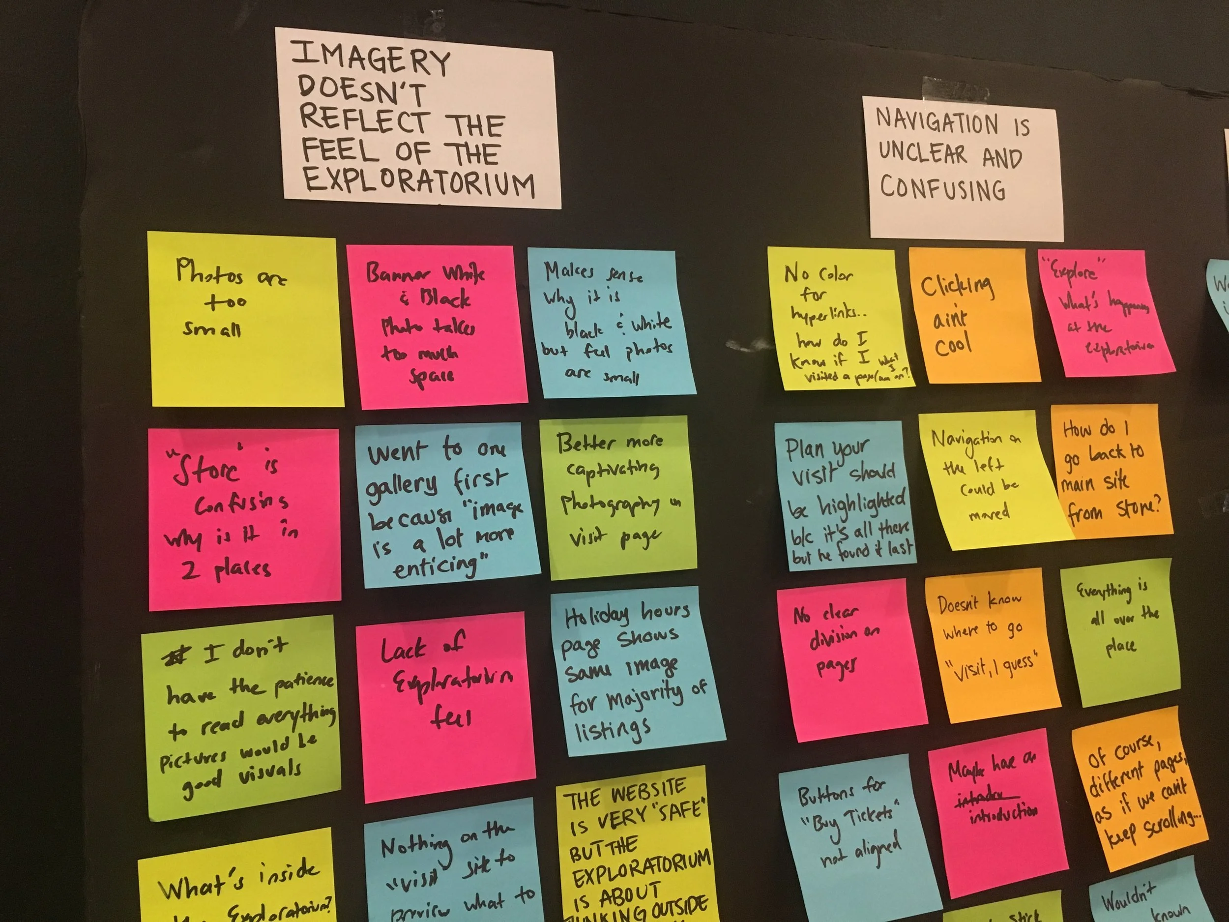
What are people saying online?
SOCIAL MEDIA LISTENING on Yelp
After digging through pages of reviews from visitors we were able to dive deep and uncover pain points that we could ease through our website. To our surprise we saw clear opportunities for our website to serve as a reliable source of support for our visitors.
AREAS FOR IMPROVEMENT


our solutions
We sorted all the data we had and began ideating on a variety of possibilities that could support the issues we were seeing being said by the customer feedback and ultimately came up with 4 new features that would be shown on our re-design of the page.

An overview of our solutions and what part of the visitors’ experience they support
TEST, ITERATE, REPEAT

We took on the white board and came up with different versions with how our design would look, ultimately we decided to test out this one.
Close up of our paper prototype. We used the orange color to signify clickable items.
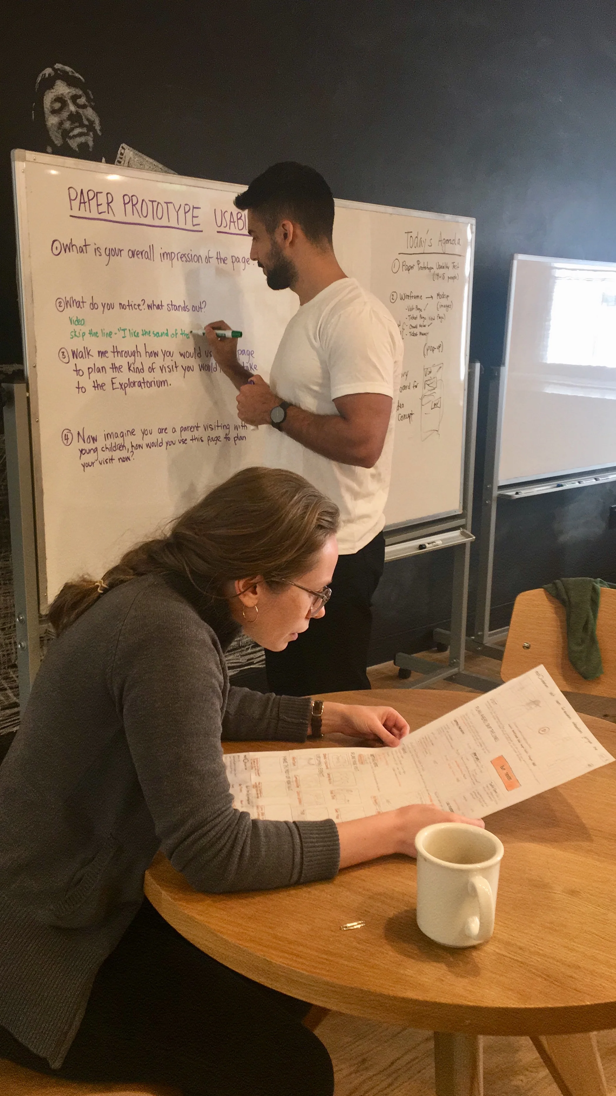
We conducted a usability test with our prototype with 4 participants and had them walk us through their thoughts and impressions of our design .
Key Takeaway :
Remove “avoid the kids” as the design should be inclusive to all ages.
Wireframes

Click on image to see full version
RESULTS & REFLECTION
The Exploratorium’s website has a wide variety of content which is used by not only visitors but also teachers and students. My team and I were able to uncover the pain points which opened up new opportunities for improvement beyond just a basic web visual re-design of the page. I personally enjoyed dissecting the data we gathered from social media listening, usability testing, and user interviews to ideate on creative solutions that not only met our user needs but also made sense for the business’s goals. Our client was quite thrilled and excited to be part of the whole design process and was very receptive to our ideas along the way.
As of 2019, the Exploratorium has taken some of our proposed solutions and implemented it on to their newly designed visit page.
“This is SO GOOD! What a great help for the redesign! Bravo! ”
“It was a pleasure working with you. Thank you so much for your thoughtful, creative and user-friendly work! ”