Web homepage Redesign | Research
conducting research to fuel a Redesign of the web homepage with a focus on personalization to increase engagement and discovery

my role
UX Research, Strategy, Visual Design
The Team:
UX Design Systems Lead / Web Platform Lead
Web Platform Product Manager
User Research Team
Analytics Team
Length:
Feb - March 2021
Overview
iHeartRadio’s web homepage is heavily relied on by users to listen to music, podcasts, radio, and news articles - all for free! The unique aspect of this offering is that users do not need to create an account to listen to have access to our libraries.
Product Vision
When a user enters the iHeartRadio website, we want them to get their primary content while providing them personalized related/recommended content in a clear way, so that they are able to engage/discover content quickly and easily.
We would like to create a homepage that can be personalized based on user type :
Anonymous User: A user who does not have an account or is visiting our page for the very first time
Returning User: A user who has an account and is logged in
Problem
Web users do not have a personalized or clear experience when it comes to finding the content they want to listen to and recommendations. From past research and analysis, it has been highlighted that users have a difficult time navigating the page due to the organization of the site, which results in a decrease in users playing content and an increase in the drop off from the web platform.
“How might we create an experience that continues to give our users access to their favorite tunes while giving them a more intuitive, fast, but also personalized experience”
Goals
Our goal is to see if the new layout increases stream starts & click-throughs
We would like to be able to serve our users content personalized to them and help them get to it in the fastest way possible.
We want to identify identity current issues around the “For You” + “Home experiences” with our returning + anon users.


KPIS:
Primary Metrics: Stream Starts ( & to CUME)
Secondary Metrics:
Click Through
ATSL (Average Time Spent Listening)
TLH (Total Listening Hours)
Process
Getting the teams & direction aligned
In order to get more clarity and a bigger picture on how our users navigate our site and how they play our content, I met with the UX Design Systems Lead, User Researchers, Web Product Manager, and Analytics teams to see if there are any previous or current findings that can help set the tone of the for the redesign.
Our UX Researchers had conducted a qualitative test a year ago (Jan 2020) and our Analytics teams were able to provide us with some quantitative data to complete our data story.
Key Findings
Quantitative
Our Analytics team provided us with robust reporting (Jan 2021) on the different entry points into playback, session length, and we found that 60% of those anonymous users created accounts and converted them into returning users.
Qualitative
In Jan of 2020, our research team conducted in-person and unmoderated interviews along with surveys with 10 participants who were all iHeartRadio users which provided us with key insights for discovery, behavior, and browsing.
Key Findings from Previous Research:
60% of users only listen to the radio in the morning on their commute (habitual listeners, morning show listeners)
40% aren’t aware of what shows, artists or playlists are new and what’s not from the current experience.
100% felt the experience could be more personalized and better organized.
30% said they didn’t know that iHeartRadio had their own original shows.
Most Interesting Finding
We discovered that many Local Radio stations had been publishing articles more frequently to stay engaged with their audience in the midst of a pandemic. Users were visiting the articles more often than before and engaging with the playable listening content (widgets) that the Local Radio stations may have included in the articles. In addition, we found that users engage often with the “for you” section that can be found on the side of any article page.
With these findings, we were able to dig up gave us the green light to keep the “For You” entry point on station articles in the forefront when conceptualizing options & research questions for the mock we build to test with users since our users have a strong tendency to listen and discover new music from there.
Opportunity for innovation
Perhaps there is an opportunity to optimize this entry point for the business (more click-through, more listening, more visitors, perhaps more conversion) and also surface it better and make it more personalized for users.
Up until now, news articles have not been given a personalized touch. This discovery could help drive innovation, get our users to become more familiar with our News offerings, and also solve for the KPIs mentioned earlier.
Competitive Research
In order to get an idea of what concepts we could potentially test, I began to do some competitive research in the landscape. I collaborated with our Design System Lead to get a better understanding of what things were feasible from the engineering side, what new components we would be able to introduce, and what concepts would be too out of scope for this particular MVP.
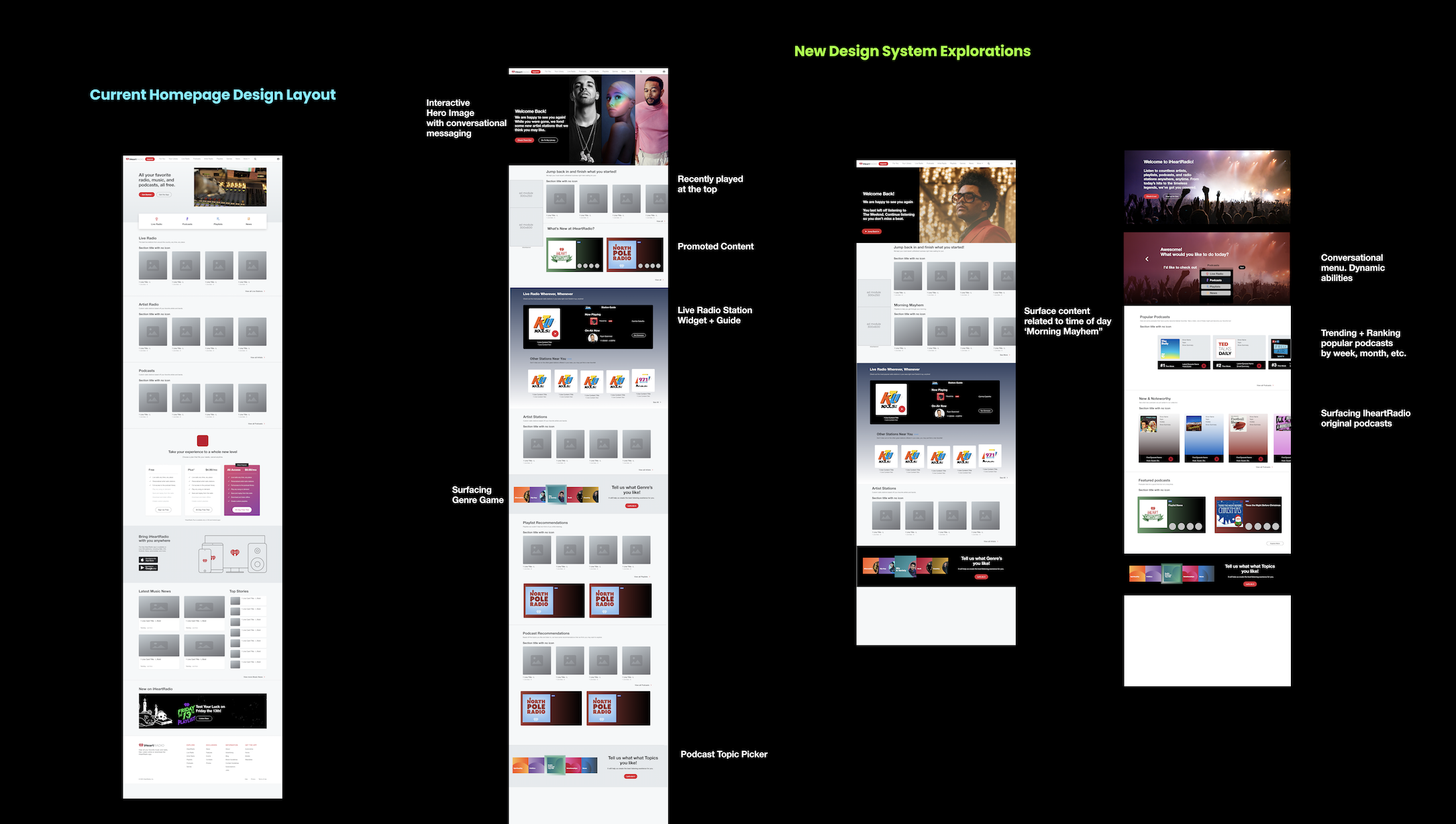
Explore, Explore, Explore
Hero Image explorations
Based on previous tests and current data we found that users interact least with the current Hero Section which features a YouTube video.
I hypothesized this would be a great opportunity to remove the video and instead surface playable content that acts as a preview during hover state, similarly to Netflix and YouTube but since that was not possible from the engineering side and surfaced Legal concerns. It was also brought to my attention that carousels were not recommended since it was tested and implemented in previous iterations but failed miserably amongst mobile users, whom we also want to be designing for. There was hardly any swipe interaction with the carousel-like the team had hoped for.


2 Different users & personalization
I ultimately came up with 2 different versions:
One hero experience for the Anon user
One hero experience for the Returning user.
The idea: A user can click on the respective CTA that appears alongside it and begin their listening experience. After consulting with the team I got the green light to add a personalized layer to it.
For an Anon user
They would see more of an informational type of hero image which would help guide them into our offerings which would trigger them to browse and click through content.
Once they leave the page and return they would see the last clicked content now shown as their hero image. The user will also have the opportunity to click a CTA that helps them “jump back in” and pick up right where they left off. We’ve been keeping tabs on ya!
For a Returning User
They would see one of these hero images :
The last content they listened to
their personalized weekly mixtape if it’s a Monday since that’s when we update their playlist
OR
If it’s been a long time since they visited ex. 1 week, we would surface a new artist, station, or playlist based on the genre preferences that they set during onboarding.
Exploring new Components & Cross-Platform Thinking
Based on previous research findings, my team and I decided that would act as a good start to incorporate some of those findings into the new mock we wanted to test. I continuously got feedback from the Design Systems Lead on our team.
We discussed ways to incorporate newer components that were more :
On-trend
Personalized
Intuitive to our users
Would be feasible from the engineering and data science side of the house
Be patterns that we can eventually bring on to other platforms (mobile & our Microsoft Desktop App specifically).
Fianlized versions ready for an A/B Test


Let the testing begin
Process Overview
Results
From our A/B Testing, we found themes based on the questions asked that validate and give us more clarity on what direction to take with this redesign.
Biggest Takeaways:
9/10 Users said they prefer Option 2
“Option 2 is better laid out and organized. Option 2 feels more personalized because of the categories, which makes it easier to click it. It feels well organized. Option 2, I love the category labels, good organization”
“Content-wise it’s better, there are so many options, first-time users would like this more.”
More concrete findings to help guide page organization & hierarchy
8/10 users come here to listen to music (live radio/playlists)
2 users said they listen to mostly podcasts
1 person said they use the Genre Picker to discover new music and trigger recommendations.
1 person mentioned they use the web platform because it's free
1 person said eventually they want to get into Podcasts
Innovative Insight from our Users
“Language is good "iHeart original podcasts is what makes you different from competitors. "try an iheart playlist sounds desperate" name it "Exclusive iHeart playlists.”
“Make it clear on why someone would want to make an account, maybe the "For you" page works off of that. Make it clear that we can create a for you selection if you create an account. I’m sure that will invite more people to create an account.
Next Steps
This is an ongoing project and will need several qual, quant tests, and iterations before it can get launched. We will need to talk to multiple squads and teams to figure out what we can and can’t do based on our findings.