Extreme Makeover - Workplace Edition
✨ Redesigning the new hire on boarding experience one slide at a time ✨
Type of Design: Presentation Design/Visual Design | New Hire Slide Deck
The Team: Sr. UX Writer, Sr. Visual Designer, Design Director
My Role: UX Writer, Researcher, Visual Designer
The Duration: 1.5 Months
The Tools: Nikon DSLR Camera, Unsplashed.com, Giphy.com, Google Slides, Illustrator


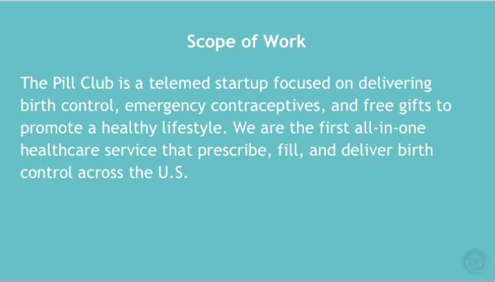
🚀 The Mission
Our HR department discovered that the slide deck that they have been presenting at orientation for new hires was outdated, off brand, long, and weak in storytelling. They asked the design team if we could re-design it in a fresh, fun, and engaging way that will shine light on Pill Club’s edgy brand and assist in building a stronger company culture. My team and I wrapped our heads together and after a few iterations, delivered a slide deck which brought out Pill Club’s quirky personality and relayed the important information concisely. Once the deck was in full use, it turned out to be a huge hit amongst the employees and the presenters!
🦄 How We Worked Our Magic
Market research (fashion, media platforms, & beauty brands: Glossier, Milk Makeup, Teen Vouge, Bustle),
Photography
UX writing
Content editing
Typography
User testing
Visual design best practices
📣 WE’VE GOT SOME ISSUES
We spoke with HR to learn more about their current slide deck’s origin and had them explain some issues they were already aware of to help give us a starting point on where there could be areas of opportunity for the re-design. We also asked them if they had any feedback from current employees who attended the orientation.
the gist
Not on brand : “we’d like for the new slide deck to stay consistent with the new high-end style that Pill Club is going for, the cool girl next door”
Lengthy and boring: “the current presentation lasts almost an hour and is 35 slides long. We’re aware our employees stop paying attention and don’t grasp the important information, which prompts them to come back to us on Slack and with questions we already covered the answers to. It’s frustrating knowing people lose interest when you have to present so much information.
Lacks storytelling: “Pill Club has developed a voice of it’s own after the re-brand and it would be great if we can carry that over to our internal materials and set the style for future materials as the company grows.”


Becoming
the cool girl next door
We researched popular “Gen Z” brands like Glossier, Milk Makeup, Kylie Cosmetics, and Teen Vogue to help guide us with photography, image selection, and an engaging magazine feel to our slide template. To the left is the image of the mood board we created to help with our creativity and vision.
The Goal : By giving Pill Club a high-end make-up/fashion vibe that the girl next door would be attracted to and feel connected to, we are not only staying trendy in the healthcare space, but we are bringing personality to our brand. Something no other competitor has successfully tackled. Our employees should be aware and proud of the new direction Pill Club is taking.

LOng story short
The HR department had given us a 25 page Google Doc filled with important information that employees need to know for their first day.
What we did: One of our priorities was to cut down the text to make the presentation more engaging, shorter, but still important. We brought out our UX writing skills to make sure the voice we were using and typography matched what was used on our website and emails and that we were able to quickly and effectively get the main point across.
The Hope: No more sleepy employees, and everyone’s retaining the information.
🖥️ how do we look?
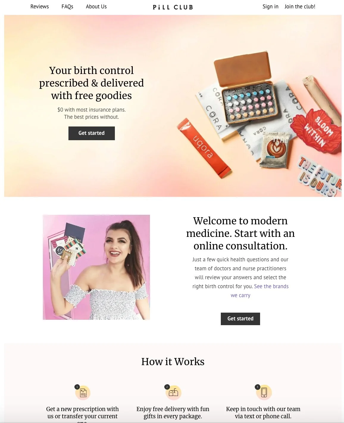
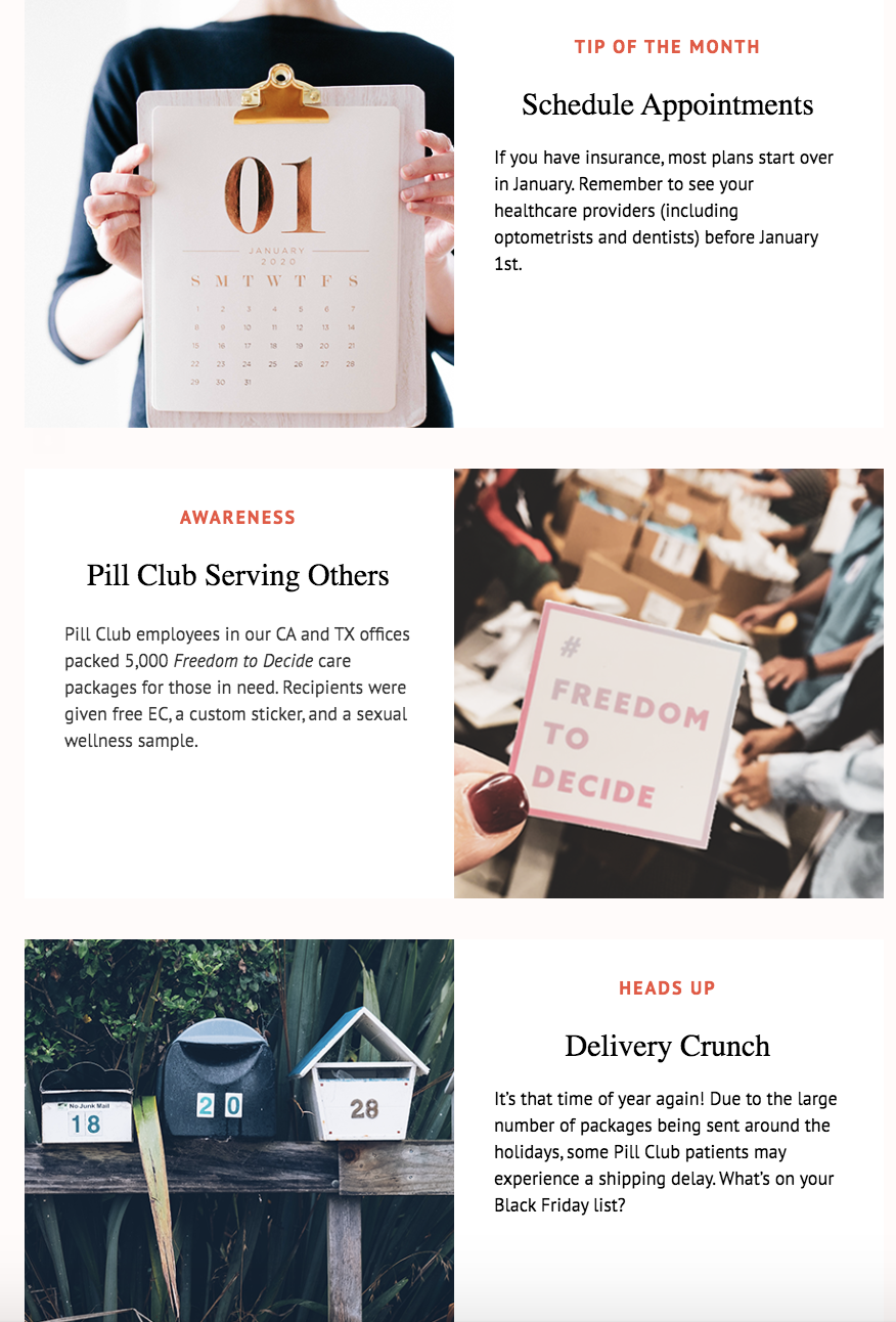
Below is a glimpse at the typography and new brand aesthetic that our website and email materials now abide by. After experimenting with the white spaces and imagery, my team and I were able to come to the final decision of how we were going to create consistency between the new hire slide deck and our emails. The goal here is that it would act as a style guide for future materials to work off of, this way our brand is in tact and there are these “evergreen design” templates available and ready to use. No more having to start from complete scratch, no more having to worry about how things need to look, all you have to do now is just plug and play!
We kept the Vogue magazine feel by having text on one side and a high quality photo on the other side. The grid like placement keeps the reader engaged, and makes it pleasing on the eyes as there is some variation. Our product photos were taken with a DSLR camera in our studio as well as outside with natural lighting (scroll down to see some behind the scenes photos) and later edited with high contrast on Adobe Illustrator (aka what would Vogue do?). The photo(s) for the partnered item of the month was either sent to us by them for us to use, or we would have to hunt for some high quality images online. Thankfully, when all else failed to tell our story Unsplashed.com and Giphy.com were available for us to save the day!


out with the old, in with the new
After a few iterations and testing amongst internal employees we were able to deliver a brand new new hire slide deck equipped with everything our emoployees would need.
💭 Learnings & Reflection
Overall, I really enjoyed being able to exercise my UX writing and visual design skills through this particular project. It was a fun and unique opportunity to be able to assist in photo shoots with employees and our products, all the way to be able to learn the process of how to select and edit images to tell your story. I think the most challenging but most collaborative part of this project was figuring out how to cut down the content in a way where it allows us to story tell in a concise manner but also make sure we aren’t removing or changing too much to the point where important information is getting lost in translation.
Now, that we have a set style template/vibe for future internal company materials to follow, I’m excited to see where some of these design elements can make an appearance in customer-facing materials (ex,. emails, blog, website) so we can keep a consistent brand/feel inside and out! Additionally, I’m looking forward for the slide deck to grow with new stories about Pill Club as the company grows.


🙌 LOVE FROM THE CLUB
“Thank you so much for doing this! It looks amazing and is working better than before! 😍”
“I know how tedious and time consuming it must’ve been to have gone through that whole deck and make changes. You did a fantastic job, thank you! ☺️”
“OMG this is beautiful and totally needed! Thank you thank you! Do you think you could re-design the All-hands deck too? 😂”
